The Ordinary is built on clarity, transparency and a highly distinctive clinical aesthetic. The challenge was to create retail ideas that could add interaction and utility without overcomplicating the brand or moving away from the stripped-back visual language that makes it so recognisable.
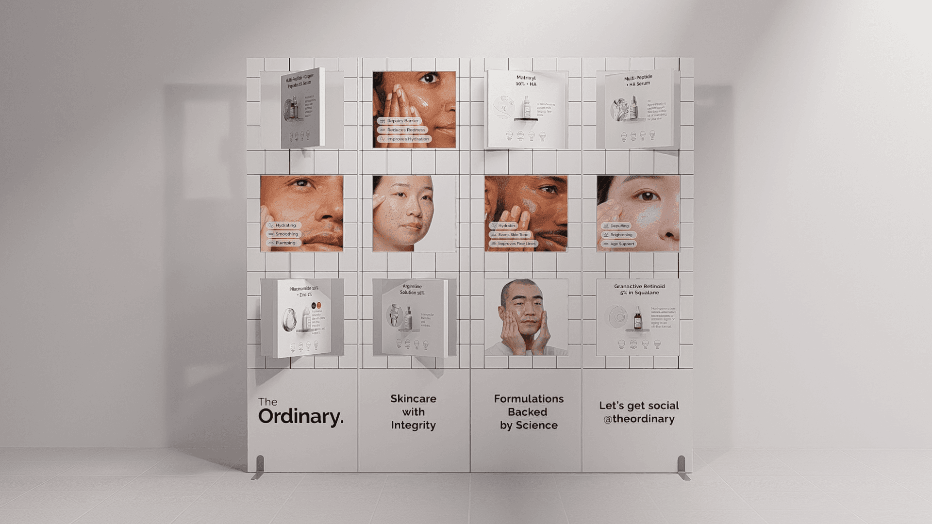
We developed three concepts that make the shopping experience more useful while keeping the brand feeling unmistakably Ordinary. A modular interactive display uses rotating cubes to reveal products, ingredients and usage information, turning passive browsing into active discovery while preserving the clean, clinical look.
The foundation tray solves a different retail challenge: making a wide shade range easier to navigate in limited space. Its 360-degree rotating format keeps the full assortment organised, supports testing and comparison, and encourages exploration without requiring additional floor space.
Beyond the counter, a reusable 2-in-1 pouch extends the brand into everyday life. Combining storage with a removable tray, it turns a simple GWP into a practical object shoppers can continue using at home or while travelling. Together, the concepts show how interaction, education and utility can add more impact to The Ordinary without adding unnecessary complexity.
The Ordinary is built on clarity, transparency and a highly distinctive clinical aesthetic. The challenge was to create retail ideas that could add interaction and utility without overcomplicating the brand or moving away from the stripped-back visual language that makes it so recognisable.
We developed three concepts that make the shopping experience more useful while keeping the brand feeling unmistakably Ordinary. A modular interactive display uses rotating cubes to reveal products, ingredients and usage information, turning passive browsing into active discovery while preserving the clean, clinical look.
The foundation tray solves a different retail challenge: making a wide shade range easier to navigate in limited space. Its 360-degree rotating format keeps the full assortment organised, supports testing and comparison, and encourages exploration without requiring additional floor space.
Beyond the counter, a reusable 2-in-1 pouch extends the brand into everyday life. Combining storage with a removable tray, it turns a simple GWP into a practical object shoppers can continue using at home or while travelling. Together, the concepts show how interaction, education and utility can add more impact to The Ordinary without adding unnecessary complexity.
The Ordinary is built on clarity, transparency and a highly distinctive clinical aesthetic. The challenge was to create retail ideas that could add interaction and utility without overcomplicating the brand or moving away from the stripped-back visual language that makes it so recognisable.
We developed three concepts that make the shopping experience more useful while keeping the brand feeling unmistakably Ordinary. A modular interactive display uses rotating cubes to reveal products, ingredients and usage information, turning passive browsing into active discovery while preserving the clean, clinical look.
The foundation tray solves a different retail challenge: making a wide shade range easier to navigate in limited space. Its 360-degree rotating format keeps the full assortment organised, supports testing and comparison, and encourages exploration without requiring additional floor space.
Beyond the counter, a reusable 2-in-1 pouch extends the brand into everyday life. Combining storage with a removable tray, it turns a simple GWP into a practical object shoppers can continue using at home or while travelling. Together, the concepts show how interaction, education and utility can add more impact to The Ordinary without adding unnecessary complexity.
The Ordinary is built on clarity, transparency and a highly distinctive clinical aesthetic. The challenge was to create retail ideas that could add interaction and utility without overcomplicating the brand or moving away from the stripped-back visual language that makes it so recognisable.
We developed three concepts that make the shopping experience more useful while keeping the brand feeling unmistakably Ordinary. A modular interactive display uses rotating cubes to reveal products, ingredients and usage information, turning passive browsing into active discovery while preserving the clean, clinical look.
The foundation tray solves a different retail challenge: making a wide shade range easier to navigate in limited space. Its 360-degree rotating format keeps the full assortment organised, supports testing and comparison, and encourages exploration without requiring additional floor space.
Beyond the counter, a reusable 2-in-1 pouch extends the brand into everyday life. Combining storage with a removable tray, it turns a simple GWP into a practical object shoppers can continue using at home or while travelling. Together, the concepts show how interaction, education and utility can add more impact to The Ordinary without adding unnecessary complexity.