
The 3-Second Shelf Test
The 3-Second Shelf Test
The 3-Second Shelf Test
The 3-Second Shelf Test
Would Someone Notice Your Brand Without the Logo?
Would Someone Notice Your Brand Without the Logo?
Would Someone Notice Your Brand Without the Logo?
Would Someone Notice Your Brand Without the Logo?
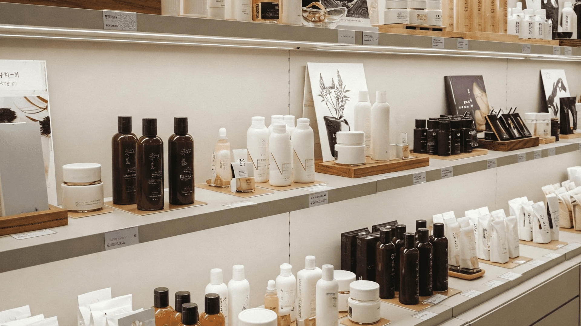
In a crowded retail environment, recognition should come from more than a name. The strongest physical brand worlds are identifiable before shoppers have read a single word.
Walk down a beauty aisle, vitamin fixture or drinks section and almost every brand is competing with the same problem. There are dozens of products, similar formats, repeated category cues and very little time to make an impression. A logo may tell shoppers whose product they are looking at, but it does not necessarily make them notice it in the first place.
That creates a useful test for any retail toolkit. Remove the logo, step a few metres away and give someone only a few seconds to look at the display. Could they still tell which brand it belongs to? If the answer is no, the physical identity may be relying too heavily on branding applied to the surface rather than distinctiveness built into the design.
Brand recognition is not limited to logos. Research into distinctive brand assets shows that colours, shapes, packaging structures and other consistent cues can become mental shortcuts that help consumers identify brands quickly. The strongest of these assets can eventually signal a brand without requiring the name to do all the work.
Recognition Starts Before Reading
Shoppers do not approach every fixture carefully examining logos and reading messaging. Much of what attracts attention happens before deliberate consideration begins. Kantar describes visual saliency as an automatic response to elements that move or stand apart from their surroundings, while its work on distinctive assets focuses on how quickly consumers connect visual cues such as colours and shapes with a brand.
This makes the first few seconds at shelf particularly interesting. Before someone understands the product proposition, there is an earlier question the physical execution needs to answer: does anything here feel recognisable enough to deserve another look? In categories such as beauty, vitamins and drinks, where neighbouring products can share remarkably similar formats, that first impression can depend on much more than communication.
A distinctive silhouette, an unusual height, a consistent block of colour or a recognisable structural feature can register before detailed messaging does. These elements do not replace the logo. They create an environment in which the logo has less work to do.
Your Fixture Has a Silhouette
Retail toolkits are often designed from the front and reviewed close up. Real shoppers do not always experience them that way. They encounter displays from the end of an aisle, through other fixtures, from different heights and while moving through a store, which means the overall physical shape can become part of the brand identity.
Height, proportion and architecture therefore matter. A repeated curved structure, an unusually tall hero element or a recognisable product-blocking system can make a fixture identifiable at a distance. Even when individual graphics become difficult to read, the silhouette remains visible.
The same principle applies across different formats. A countertop unit, freestanding display and shelf intervention do not need to look identical, but they should feel as though they belong to the same physical family. When those structural codes are repeated consistently, the toolkit itself starts building recognition.
Colour Blocking Is More Than Decoration
Colour is one of the quickest ways to create visual territory, but simply applying a brand colour to every available surface is not enough. The more important question is whether that colour is being used in a sufficiently consistent and distinctive way to become associated with the brand.
Kantar's research highlights clarity and consistency as important characteristics of strong brand assets, while also cautioning that colours and symbols used alone can sometimes be attributed to competitors if they are not sufficiently established. That distinction matters in categories where several brands may naturally occupy similar visual territories, such as pastel skincare, clinical white supplements or dark premium spirits.
Physical design can strengthen ownership by turning colour into a system rather than a coating. A recognisable colour block, repeated contrast, specific placement or relationship between product and fixture can become much harder for competitors to accidentally replicate. The objective is not simply to be colourful. It is to create a visual pattern that becomes familiar.
Texture and Material Can Become Brand Codes Too
Distinctiveness does not have to be purely graphic. Physical retail has access to something digital communication does not: materiality. Matte surfaces, brushed metal, translucent acrylic, soft-touch finishes, illumination, embossed structures and unexpected material combinations can all influence how a brand is perceived before someone reads its message.
For beauty, that might mean translating softness, clinical efficacy or luxury into materials. A vitamin brand might use structure and transparency to communicate science or simplicity. A drinks brand might create recognition through a particular illuminated edge, metallic treatment or architectural form. The important part is consistency between what the brand stands for and what the shopper physically encounters.
When these choices are repeated across touchpoints, material becomes more than a production specification. It becomes another cue that tells consumers who they are looking at.
Movement Can Break the Pattern
Most retail environments are relatively static, which makes controlled movement particularly powerful. A rotating product, changing light sequence, mechanical interaction or moving demonstration can interrupt the visual pattern of a shelf without requiring a larger logo or another promotional message.
Movement works because it can attract attention before the shopper has consciously decided what to examine. Kantar notes that the brain responds automatically to visual elements that move or stand out from their surroundings. The opportunity for POSM is to use that behaviour deliberately rather than treating motion as an added gimmick.
The movement still needs to belong to the brand. If every execution uses a completely different mechanism simply because it is novel, recognition never develops. When a particular behaviour or interaction becomes repeatable across activations, movement itself can contribute to the physical brand language.
Consistency Is What Turns Design Into Recognition
One distinctive display can attract attention, but repetition is what gives physical assets meaning. The Ehrenberg-Bass Institute argues that distinctive assets become valuable when consumers associate them uniquely and strongly with a particular brand, while Kantar similarly points to consistent deployment across touchpoints as a way of reinforcing memory structures.
This creates an important challenge for global retail toolkits. Adaptation is often necessary because store formats, footprints, regulations and budgets change between markets. If every adaptation also changes the colours, proportions, materials and structural language, however, the brand effectively starts again every time.
A stronger toolkit identifies which elements are flexible and which should remain recognisable. The size might change, the product configuration might change and the format might change, while a smaller set of distinctive physical codes remains constant.
Merch & Effect POV: Build Recognition Into the Object
A logo is an important brand asset, but it should not be responsible for carrying the entire physical identity of a retail toolkit. When the logo is the only recognisable element, removing it can reveal how interchangeable the rest of the execution really is.
At Merch & Effect, we believe physical brand recognition should be considered from the beginning of the design process. Blocking, silhouette, height, materials, texture, illumination, movement and interaction can all become part of a recognisable system. The objective is not to make every display louder or more unusual. It is to decide which physical cues genuinely belong to the brand and then use them consistently enough to build memory.
The three-second shelf test is therefore deliberately simple. Cover the logo and look again. If the display could comfortably belong to five competitors, there is still work to do. If the brand remains recognisable through its shape, colour, material and behaviour, the physical toolkit is doing something much more valuable than carrying an identity. It is becoming part of that identity.
In a crowded retail environment, recognition should come from more than a name. The strongest physical brand worlds are identifiable before shoppers have read a single word.
Walk down a beauty aisle, vitamin fixture or drinks section and almost every brand is competing with the same problem. There are dozens of products, similar formats, repeated category cues and very little time to make an impression. A logo may tell shoppers whose product they are looking at, but it does not necessarily make them notice it in the first place.
That creates a useful test for any retail toolkit. Remove the logo, step a few metres away and give someone only a few seconds to look at the display. Could they still tell which brand it belongs to? If the answer is no, the physical identity may be relying too heavily on branding applied to the surface rather than distinctiveness built into the design.
Brand recognition is not limited to logos. Research into distinctive brand assets shows that colours, shapes, packaging structures and other consistent cues can become mental shortcuts that help consumers identify brands quickly. The strongest of these assets can eventually signal a brand without requiring the name to do all the work.
Recognition Starts Before Reading
Shoppers do not approach every fixture carefully examining logos and reading messaging. Much of what attracts attention happens before deliberate consideration begins. Kantar describes visual saliency as an automatic response to elements that move or stand apart from their surroundings, while its work on distinctive assets focuses on how quickly consumers connect visual cues such as colours and shapes with a brand.
This makes the first few seconds at shelf particularly interesting. Before someone understands the product proposition, there is an earlier question the physical execution needs to answer: does anything here feel recognisable enough to deserve another look? In categories such as beauty, vitamins and drinks, where neighbouring products can share remarkably similar formats, that first impression can depend on much more than communication.
A distinctive silhouette, an unusual height, a consistent block of colour or a recognisable structural feature can register before detailed messaging does. These elements do not replace the logo. They create an environment in which the logo has less work to do.
Your Fixture Has a Silhouette
Retail toolkits are often designed from the front and reviewed close up. Real shoppers do not always experience them that way. They encounter displays from the end of an aisle, through other fixtures, from different heights and while moving through a store, which means the overall physical shape can become part of the brand identity.
Height, proportion and architecture therefore matter. A repeated curved structure, an unusually tall hero element or a recognisable product-blocking system can make a fixture identifiable at a distance. Even when individual graphics become difficult to read, the silhouette remains visible.
The same principle applies across different formats. A countertop unit, freestanding display and shelf intervention do not need to look identical, but they should feel as though they belong to the same physical family. When those structural codes are repeated consistently, the toolkit itself starts building recognition.
Colour Blocking Is More Than Decoration
Colour is one of the quickest ways to create visual territory, but simply applying a brand colour to every available surface is not enough. The more important question is whether that colour is being used in a sufficiently consistent and distinctive way to become associated with the brand.
Kantar's research highlights clarity and consistency as important characteristics of strong brand assets, while also cautioning that colours and symbols used alone can sometimes be attributed to competitors if they are not sufficiently established. That distinction matters in categories where several brands may naturally occupy similar visual territories, such as pastel skincare, clinical white supplements or dark premium spirits.
Physical design can strengthen ownership by turning colour into a system rather than a coating. A recognisable colour block, repeated contrast, specific placement or relationship between product and fixture can become much harder for competitors to accidentally replicate. The objective is not simply to be colourful. It is to create a visual pattern that becomes familiar.
Texture and Material Can Become Brand Codes Too
Distinctiveness does not have to be purely graphic. Physical retail has access to something digital communication does not: materiality. Matte surfaces, brushed metal, translucent acrylic, soft-touch finishes, illumination, embossed structures and unexpected material combinations can all influence how a brand is perceived before someone reads its message.
For beauty, that might mean translating softness, clinical efficacy or luxury into materials. A vitamin brand might use structure and transparency to communicate science or simplicity. A drinks brand might create recognition through a particular illuminated edge, metallic treatment or architectural form. The important part is consistency between what the brand stands for and what the shopper physically encounters.
When these choices are repeated across touchpoints, material becomes more than a production specification. It becomes another cue that tells consumers who they are looking at.
Movement Can Break the Pattern
Most retail environments are relatively static, which makes controlled movement particularly powerful. A rotating product, changing light sequence, mechanical interaction or moving demonstration can interrupt the visual pattern of a shelf without requiring a larger logo or another promotional message.
Movement works because it can attract attention before the shopper has consciously decided what to examine. Kantar notes that the brain responds automatically to visual elements that move or stand out from their surroundings. The opportunity for POSM is to use that behaviour deliberately rather than treating motion as an added gimmick.
The movement still needs to belong to the brand. If every execution uses a completely different mechanism simply because it is novel, recognition never develops. When a particular behaviour or interaction becomes repeatable across activations, movement itself can contribute to the physical brand language.
Consistency Is What Turns Design Into Recognition
One distinctive display can attract attention, but repetition is what gives physical assets meaning. The Ehrenberg-Bass Institute argues that distinctive assets become valuable when consumers associate them uniquely and strongly with a particular brand, while Kantar similarly points to consistent deployment across touchpoints as a way of reinforcing memory structures.
This creates an important challenge for global retail toolkits. Adaptation is often necessary because store formats, footprints, regulations and budgets change between markets. If every adaptation also changes the colours, proportions, materials and structural language, however, the brand effectively starts again every time.
A stronger toolkit identifies which elements are flexible and which should remain recognisable. The size might change, the product configuration might change and the format might change, while a smaller set of distinctive physical codes remains constant.
Merch & Effect POV: Build Recognition Into the Object
A logo is an important brand asset, but it should not be responsible for carrying the entire physical identity of a retail toolkit. When the logo is the only recognisable element, removing it can reveal how interchangeable the rest of the execution really is.
At Merch & Effect, we believe physical brand recognition should be considered from the beginning of the design process. Blocking, silhouette, height, materials, texture, illumination, movement and interaction can all become part of a recognisable system. The objective is not to make every display louder or more unusual. It is to decide which physical cues genuinely belong to the brand and then use them consistently enough to build memory.
The three-second shelf test is therefore deliberately simple. Cover the logo and look again. If the display could comfortably belong to five competitors, there is still work to do. If the brand remains recognisable through its shape, colour, material and behaviour, the physical toolkit is doing something much more valuable than carrying an identity. It is becoming part of that identity.
In a crowded retail environment, recognition should come from more than a name. The strongest physical brand worlds are identifiable before shoppers have read a single word.
Walk down a beauty aisle, vitamin fixture or drinks section and almost every brand is competing with the same problem. There are dozens of products, similar formats, repeated category cues and very little time to make an impression. A logo may tell shoppers whose product they are looking at, but it does not necessarily make them notice it in the first place.
That creates a useful test for any retail toolkit. Remove the logo, step a few metres away and give someone only a few seconds to look at the display. Could they still tell which brand it belongs to? If the answer is no, the physical identity may be relying too heavily on branding applied to the surface rather than distinctiveness built into the design.
Brand recognition is not limited to logos. Research into distinctive brand assets shows that colours, shapes, packaging structures and other consistent cues can become mental shortcuts that help consumers identify brands quickly. The strongest of these assets can eventually signal a brand without requiring the name to do all the work.
Recognition Starts Before Reading
Shoppers do not approach every fixture carefully examining logos and reading messaging. Much of what attracts attention happens before deliberate consideration begins. Kantar describes visual saliency as an automatic response to elements that move or stand apart from their surroundings, while its work on distinctive assets focuses on how quickly consumers connect visual cues such as colours and shapes with a brand.
This makes the first few seconds at shelf particularly interesting. Before someone understands the product proposition, there is an earlier question the physical execution needs to answer: does anything here feel recognisable enough to deserve another look? In categories such as beauty, vitamins and drinks, where neighbouring products can share remarkably similar formats, that first impression can depend on much more than communication.
A distinctive silhouette, an unusual height, a consistent block of colour or a recognisable structural feature can register before detailed messaging does. These elements do not replace the logo. They create an environment in which the logo has less work to do.
Your Fixture Has a Silhouette
Retail toolkits are often designed from the front and reviewed close up. Real shoppers do not always experience them that way. They encounter displays from the end of an aisle, through other fixtures, from different heights and while moving through a store, which means the overall physical shape can become part of the brand identity.
Height, proportion and architecture therefore matter. A repeated curved structure, an unusually tall hero element or a recognisable product-blocking system can make a fixture identifiable at a distance. Even when individual graphics become difficult to read, the silhouette remains visible.
The same principle applies across different formats. A countertop unit, freestanding display and shelf intervention do not need to look identical, but they should feel as though they belong to the same physical family. When those structural codes are repeated consistently, the toolkit itself starts building recognition.
Colour Blocking Is More Than Decoration
Colour is one of the quickest ways to create visual territory, but simply applying a brand colour to every available surface is not enough. The more important question is whether that colour is being used in a sufficiently consistent and distinctive way to become associated with the brand.
Kantar's research highlights clarity and consistency as important characteristics of strong brand assets, while also cautioning that colours and symbols used alone can sometimes be attributed to competitors if they are not sufficiently established. That distinction matters in categories where several brands may naturally occupy similar visual territories, such as pastel skincare, clinical white supplements or dark premium spirits.
Physical design can strengthen ownership by turning colour into a system rather than a coating. A recognisable colour block, repeated contrast, specific placement or relationship between product and fixture can become much harder for competitors to accidentally replicate. The objective is not simply to be colourful. It is to create a visual pattern that becomes familiar.
Texture and Material Can Become Brand Codes Too
Distinctiveness does not have to be purely graphic. Physical retail has access to something digital communication does not: materiality. Matte surfaces, brushed metal, translucent acrylic, soft-touch finishes, illumination, embossed structures and unexpected material combinations can all influence how a brand is perceived before someone reads its message.
For beauty, that might mean translating softness, clinical efficacy or luxury into materials. A vitamin brand might use structure and transparency to communicate science or simplicity. A drinks brand might create recognition through a particular illuminated edge, metallic treatment or architectural form. The important part is consistency between what the brand stands for and what the shopper physically encounters.
When these choices are repeated across touchpoints, material becomes more than a production specification. It becomes another cue that tells consumers who they are looking at.
Movement Can Break the Pattern
Most retail environments are relatively static, which makes controlled movement particularly powerful. A rotating product, changing light sequence, mechanical interaction or moving demonstration can interrupt the visual pattern of a shelf without requiring a larger logo or another promotional message.
Movement works because it can attract attention before the shopper has consciously decided what to examine. Kantar notes that the brain responds automatically to visual elements that move or stand out from their surroundings. The opportunity for POSM is to use that behaviour deliberately rather than treating motion as an added gimmick.
The movement still needs to belong to the brand. If every execution uses a completely different mechanism simply because it is novel, recognition never develops. When a particular behaviour or interaction becomes repeatable across activations, movement itself can contribute to the physical brand language.
Consistency Is What Turns Design Into Recognition
One distinctive display can attract attention, but repetition is what gives physical assets meaning. The Ehrenberg-Bass Institute argues that distinctive assets become valuable when consumers associate them uniquely and strongly with a particular brand, while Kantar similarly points to consistent deployment across touchpoints as a way of reinforcing memory structures.
This creates an important challenge for global retail toolkits. Adaptation is often necessary because store formats, footprints, regulations and budgets change between markets. If every adaptation also changes the colours, proportions, materials and structural language, however, the brand effectively starts again every time.
A stronger toolkit identifies which elements are flexible and which should remain recognisable. The size might change, the product configuration might change and the format might change, while a smaller set of distinctive physical codes remains constant.
Merch & Effect POV: Build Recognition Into the Object
A logo is an important brand asset, but it should not be responsible for carrying the entire physical identity of a retail toolkit. When the logo is the only recognisable element, removing it can reveal how interchangeable the rest of the execution really is.
At Merch & Effect, we believe physical brand recognition should be considered from the beginning of the design process. Blocking, silhouette, height, materials, texture, illumination, movement and interaction can all become part of a recognisable system. The objective is not to make every display louder or more unusual. It is to decide which physical cues genuinely belong to the brand and then use them consistently enough to build memory.
The three-second shelf test is therefore deliberately simple. Cover the logo and look again. If the display could comfortably belong to five competitors, there is still work to do. If the brand remains recognisable through its shape, colour, material and behaviour, the physical toolkit is doing something much more valuable than carrying an identity. It is becoming part of that identity.
beyond posm



beyond posm
beyond posm