
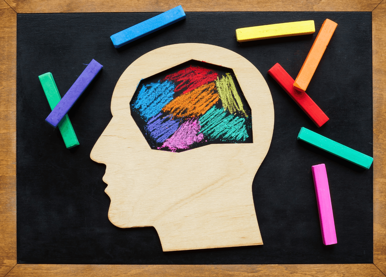
Neurodivergent Retail
Neurodivergent Retail
Neurodivergent Retail
Neurodivergent Retail
Designing for Different Brains
Designing for Different Brains
Designing for Different Brains
Designing for Different Brains
Retail isn’t neutral. It’s loud. It’s bright. It’s overwhelming.
And for millions of neurodivergent consumers: people living with ADHD, autism, dyslexia, sensory processing sensitivity, or anxiety, it’s not just inconvenient. It’s alienating.
Most POSM is designed for the neurotypical majority: rapid scanning, high-stimuli environments, and heavy reliance on reading and decision speed. But real shoppers aren’t all wired the same. And the brands that start recognising that will unlock something far bigger than compliance.
They’ll build loyalty through empathy.
🧠 The Reality Behind the Shelf
Let’s reframe the “average shopper.”
1 in 5 people globally are estimated to be neurodivergent.
In-store environments often trigger sensory overload: harsh lighting, clashing colours, high-decibel music, chaotic signage.
People with ADHD struggle with excessive choice and low-priority filtering.
Autistic consumers may avoid high-touch or overly interactive formats.
Anxiety-prone individuals often feel time pressure or fear of “getting it wrong.”
In this context, a well-intended POSM unit with five flashing messages and three font styles isn’t engaging. It’s a barrier.
🛠️ Design Principles for Neuro-Inclusive POSM
You don’t need to build a different world, you just need to design better within the one we have. Here’s how POSM can shift from generic to generous:
1. Clarity over cleverness
Use simple, direct language. Avoid puns or jargon.
Break text into digestible chunks. Bullet points > paragraphs.
Lead with function: “Hydrates fast” is better than “Drench your skin in morning dew.”
✅ Cognitive ease builds comfort, and action.
2. Minimise sensory overload
Avoid high-saturation colour clashes.
Use calm, grounded tones and high contrast, not rainbow gradients.
Limit moving parts, flashing lights, or sound triggers unless essential.
✅ Create mental breathing space, especially in overstimulating environments.
3. Linear, not scattershot, layouts
Use clear Z- or F-patterns that guide the eye predictably.
Anchor information in consistent positions across variations.
Don’t overload every panel, give people space to process.
✅ Predictability reduces stress and decision fatigue.
4. Tactility that soothes, not surprises
Use soft-touch or matte finishes over glossy, slippery materials.
Avoid sharp edges or unexpected textures.
Consider materials with natural grounding effects, like unfinished wood or stone textures.
✅ Touch is powerful, but it should be grounding, not jarring.
🧭 Brands Leading With Inclusive Retail Design
LUSH: Clear, repeatable displays with consistent iconography and minimal copy, plus staff trained in calm, empathetic engagement.
Muji: Visual silence. Neutrals, spacing, clear product zones. No sensory chaos, just accessible order.
Aesop: One scent per moment. One material tone. No signage clutter. A sensory hug for those who need calm.
Boots UK (select stores): Implementing low-sensory shopping hours, with dimmed lights and minimal noise, a cue for POSM designers to match the mood.
These aren't accessibility add-ons. They’re part of a smarter, more humane brand world.
🧠 Merch & Effect POV
At Merch & Effect, we believe inclusive design isn’t a limitation, it’s a lens. One that sharpens your brand, simplifies your message, and deepens your emotional connection.
We design POSM not for “everyone”, but for all kinds of someones. For the shopper who needs clarity. The one who needs space. The one who’s overstimulated, unsure, or just trying to make one good decision today.
Because when your physical presence feels safe, easy, and clear, people stay longer.
And when they stay longer, they engage deeper.
beyond posm


