
Anti-Packaging
Anti-Packaging
Anti-Packaging
Anti-Packaging
The Brands Saying “Less is More” (Literally)
The Brands Saying “Less is More” (Literally)
The Brands Saying “Less is More” (Literally)
The Brands Saying “Less is More” (Literally)
Unboxing used to be the moment. Now, increasingly, the best brands don’t want you to notice the box at all.
In a shift that’s turning heads in beauty, wellness, spirits, and even luxury, packaging minimalism has moved beyond aesthetic preference and into strategic principle. Less ink. Less plastic. Fewer flourishes. Fewer claims. No excess foam, ribbon, filler, fanfare.
The goal? Let the product - and the planet - breathe.
This isn’t about “bare” packaging. It’s about restraint that signals confidence. And for POSM designers, it’s creating a new challenge: how do you stop supporting the box, and start amplifying the experience?
🧠 Why Anti-Packaging Works
Packaging has long been the silent salesperson. But now, many shoppers - especially Gen Z and Millennials - see excess packaging as a red flag:
Wasteful
Performative
Overcompensating
Instead, they’re drawn to packaging that feels:
Quiet instead of boastful
Intentional instead of decorative
Functional instead of theatrical
Consumers associate minimal packaging with:
Sustainability: Less stuff = less guilt
Purity: “If you’re not hiding behind packaging, the product must be good”
Intimacy: A more personal, less performative interaction
🛠️ What This Means for POSM
When packaging disappears, POSM becomes more important, not less, because it now carries the role of context, tone, and stage-setting.
1. Design to frame, not to fight
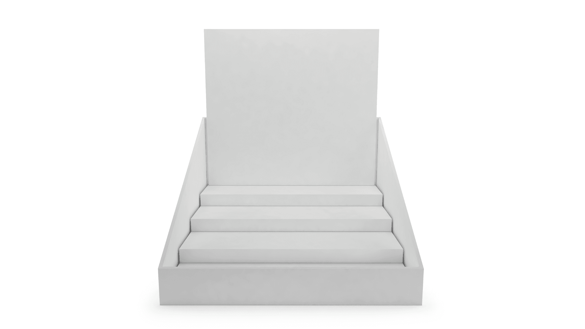
If the primary pack is minimal, POSM should act like gallery framing, not a second billboard. Use soft underlighting, shadowboxes, or neutral tones to elevate without shouting.
✅ Think concept store, not carnival.
2. Materiality = storytelling
If the product is low-impact, natural, or zero-waste, reflect that in your POSM materials. Don’t wrap a paper-wrapped serum in a plastic glorifier. Use:
Raw wood, brushed aluminum, matte stone
Recycled acrylic or pressed pulp
Minimal fasteners, clean corners
✅ Form should follow values, not just visuals.
3. Copy = whisper, not pitch
Use subtle language hierarchy. Consider no header at all. Let the tester or open pack be the focal point. If words are needed, lean on:
Provenance (“Grown in Sicily”)
Simplicity (“No preservatives. No waste.”)
Instructional elegance (“Twist. Pour. Pause.”)
✅ Let silence do the selling.
🧭 Brands Living the Anti-Packaging Ethos
Typology (Paris): Products arrive in flat cardboard sleeves with minimal ink. On shelf, they rest in modular stone trays with no header copy.
Byredo: Perfume testers placed on raw concrete with nothing more than a single line of scent description.
Seed Health: Pill vials shipped in reusable glass jars: no colour, no noise, just science-forward minimalism.
Vermouth Routin: Uses apothecary-style bottles and minimal labeling; in store, supported by wood-and-glass POS that suggests timeworn heritage without decorative fluff.
Each brand is clear: this isn’t about being boring. It’s about being deliberate.
🧠 Merch & Effect POV
At Merch & Effect, we understand that sometimes, the loudest brand is the one that steps back. When packaging goes minimal, POSM must carry emotion through form, material, and spatial design, not through noise.
We craft displays that give space to quiet brands. That frame, don’t flaunt. That feel like extensions of product truth, not distractions from it.
Because the future of packaging isn’t about “more.”
It’s about knowing exactly what’s worth saying, and what’s not.
Unboxing used to be the moment. Now, increasingly, the best brands don’t want you to notice the box at all.
In a shift that’s turning heads in beauty, wellness, spirits, and even luxury, packaging minimalism has moved beyond aesthetic preference and into strategic principle. Less ink. Less plastic. Fewer flourishes. Fewer claims. No excess foam, ribbon, filler, fanfare.
The goal? Let the product - and the planet - breathe.
This isn’t about “bare” packaging. It’s about restraint that signals confidence. And for POSM designers, it’s creating a new challenge: how do you stop supporting the box, and start amplifying the experience?
🧠 Why Anti-Packaging Works
Packaging has long been the silent salesperson. But now, many shoppers - especially Gen Z and Millennials - see excess packaging as a red flag:
Wasteful
Performative
Overcompensating
Instead, they’re drawn to packaging that feels:
Quiet instead of boastful
Intentional instead of decorative
Functional instead of theatrical
Consumers associate minimal packaging with:
Sustainability: Less stuff = less guilt
Purity: “If you’re not hiding behind packaging, the product must be good”
Intimacy: A more personal, less performative interaction
🛠️ What This Means for POSM
When packaging disappears, POSM becomes more important, not less, because it now carries the role of context, tone, and stage-setting.
1. Design to frame, not to fight
If the primary pack is minimal, POSM should act like gallery framing, not a second billboard. Use soft underlighting, shadowboxes, or neutral tones to elevate without shouting.
✅ Think concept store, not carnival.
2. Materiality = storytelling
If the product is low-impact, natural, or zero-waste, reflect that in your POSM materials. Don’t wrap a paper-wrapped serum in a plastic glorifier. Use:
Raw wood, brushed aluminum, matte stone
Recycled acrylic or pressed pulp
Minimal fasteners, clean corners
✅ Form should follow values, not just visuals.
3. Copy = whisper, not pitch
Use subtle language hierarchy. Consider no header at all. Let the tester or open pack be the focal point. If words are needed, lean on:
Provenance (“Grown in Sicily”)
Simplicity (“No preservatives. No waste.”)
Instructional elegance (“Twist. Pour. Pause.”)
✅ Let silence do the selling.
🧭 Brands Living the Anti-Packaging Ethos
Typology (Paris): Products arrive in flat cardboard sleeves with minimal ink. On shelf, they rest in modular stone trays with no header copy.
Byredo: Perfume testers placed on raw concrete with nothing more than a single line of scent description.
Seed Health: Pill vials shipped in reusable glass jars: no colour, no noise, just science-forward minimalism.
Vermouth Routin: Uses apothecary-style bottles and minimal labeling; in store, supported by wood-and-glass POS that suggests timeworn heritage without decorative fluff.
Each brand is clear: this isn’t about being boring. It’s about being deliberate.
🧠 Merch & Effect POV
At Merch & Effect, we understand that sometimes, the loudest brand is the one that steps back. When packaging goes minimal, POSM must carry emotion through form, material, and spatial design, not through noise.
We craft displays that give space to quiet brands. That frame, don’t flaunt. That feel like extensions of product truth, not distractions from it.
Because the future of packaging isn’t about “more.”
It’s about knowing exactly what’s worth saying, and what’s not.
beyond posm


